

Date and time selection is a small interaction with large consequences. A confusing field can cause missed appointments, failed deliveries, incorrect reservations, and abandoned forms. Reviewing proven date UI patterns can help teams see how different mobile flows handle scheduling, availability, and confirmation without copying a design that does not fit the task.
The best picker is not necessarily the most visually impressive one. It is the one that lets a person make a confident choice quickly, whether they are entering a birthday, booking a flight, selecting a delivery window, or scheduling a meeting across time zones.
1. Why Date And Time Controls Matter
Date and time fields often appear in high-pressure moments. Someone may be arranging airport pickup, paying a bill before a deadline, or reserving a limited appointment slot. Labels such as “When?” and formats such as “04/05/26” leave too much room for interpretation.
Context should drive the interaction. Selecting a birthday usually calls for a precise, possibly distant date. Choosing a delivery window is a near-term decision that may work better with available time slots and plain-language options such as “Today, 4:00 PM to 6:00 PM.”
2. Choose The Right Control For The Task
Match the control to the amount of information people need to see and the precision they need to provide. Familiar behavior usually reduces learning effort, and reviewing picker choices that support direct selection can reinforce the value of clear, platform-appropriate controls.
- Calendar picker: Best when nearby days, availability, or a monthly schedule affect the decision.
- Scrolling wheel: Useful for small, familiar ranges, such as selecting an hour or minute.
- Text input: Helpful for distant dates, exact values, and people who already know what to enter.
- Segmented fields: Strong for birthdays and formal dates because month, day, and year remain separate.
- Range selector: Useful for hotels, travel, reporting periods, and date-based filters.
- Preset choices: Efficient for common decisions, including Today, Tomorrow, This Weekend, and Next Week.
3. Design For Fast, Low-Error Entry
Every screen should make the next action obvious. Use labels such as “Start date,” “Return date,” and “Arrival time,” then display the completed choice in a readable form, such as “Friday, August 14, 2026, at 3:30 PM.” Avoid making users remember one value while they navigate to another screen.
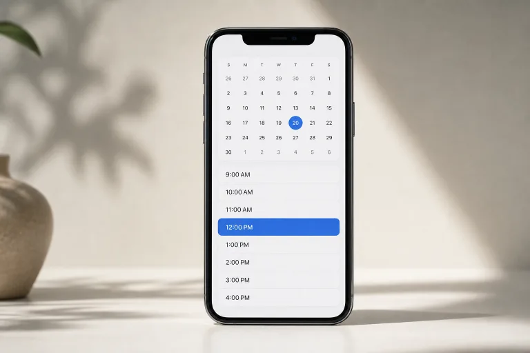
- Open the picker from a clearly labeled field.
- Start from a sensible default, but never silently replace a user’s choice.
- Keep the primary action visible, such as “Apply” or “Save time.”
- Show immediate feedback after a date or time is selected.
- Use presets when they remove work rather than hide important details.
4. Make The Interface Accessible
A picker must work for more than people who can see a compact calendar and tap tiny day numbers. Use labels that remain meaningful when read aloud, provide logical keyboard movement where supported, and ensure selected, unavailable, and current dates are distinguishable without color alone. The accessibility considerations for date fields also highlight why date controls need careful implementation and testing.
Support larger text, increased contrast, visible focus indicators, and comfortable touch targets. Manual entry should remain available when browsing months is slower or harder than typing. Automated checks help, but real testing with screen readers, zoom settings, keyboards, and varied motor abilities reveals issues that code scanners can miss.
5. Handle Local Formats And Time Zones
Numeric dates can be risky. “04/05/2026” may mean April 5 or May 4, depending on the person’s region. Spell out the month when ambiguity matters, especially in confirmations, receipts, and notifications. Keep local display formats familiar while storing dates and times in a consistent system format behind the scenes.
Show the time zone whenever people may be traveling, joining remotely, or watching a live event. A meeting at 9:00 AM should say whether that means the attendee’s local time, Eastern Time, or another named zone. Also test daylight-saving changes, events crossing midnight, and dates near a year change.
6. Support One-Handed Mobile Use
Mobile users may be walking, holding a bag, or switching between apps. Put the important choice and confirmation action within easy reach. Keep Cancel and Save visible, avoid long scrolling lists when a short set of available slots will work, and test small screens, landscape mode, and large-text settings.
For example, a person choosing a pickup time while carrying groceries should see large tap targets, only valid times, and a clear final state, such as “Pickup scheduled for today at 5:30 PM.”
7. Prevent Common User Mistakes
Good design prevents errors before the form is submitted. Disable impossible dates, but explain the reason, such as “Bookings require 24 hours’ notice.” Show operating hours and minimum-stay rules close to the relevant field. If an end time falls before the start time, flag the conflict immediately without erasing the valid information already entered.
Make morning, afternoon, and evening explicit when needed. Place error messages beside the affected field, describe the correction in plain language, and preserve the rest of the user’s work.
8. Test Date And Time Flows
Start testing before visual polish makes a weak pattern expensive to change. Define the task, prototype two or three suitable controls, and observe people using different devices and input methods. Record hesitation, backtracking, corrections, completion rate, and confidence, not just speed.
Include edge cases such as leap day, unavailable dates, time-zone shifts, daylight-saving transitions, and date ranges that cross months or years. Support requests and repeated corrections often reveal a problem that a short completion time does not.
9. Common Questions
Should A Mobile App Use A Native Picker?
Usually, native controls are a strong starting point because they are familiar and often include built-in accessibility behavior. Custom controls can work when the task has unusual scheduling rules, but they require broader testing.
When Should Users Type A Date Instead Of Picking It?
Typing is often faster for birthdays, distant dates, and exact values users already know. A picker can still be available as an optional aid.
How Should An App Show A Date Range?
Display start and end values together, clearly label each one, and state whether the final day is included when that affects pricing, access, or availability.
Should The App Show The Time Zone?
Yes, when traveling, remote attendees, broadcasts, or deadlines could create confusion. The cost of a short label is far lower than the cost of a missed event.
10. Conclusion
Clear date and time pickers make decisions easier rather than more decorative. Choose controls that fit the task, use plain labels and unambiguous formats, account for time zones, support accessible interaction, and test real-world edge cases. When people can select a date or time with confidence, the entire mobile experience feels faster and more trustworthy.